Well, let’s be honest, who doesn’t love a good font? There’s just something about the way a well-crafted typeface can make you feel that’s hard to put into words. And when you pair that with the beauty and creativity of art, you’ve got a winning combination.
That’s why we’re excited to delve into the world of typography in art and explore the ways in which typefaces can enhance and elevate artistic expression. From playful fonts to elegant and sophisticated ones, there’s no shortage of possibilities when it comes to typography in art. So, let’s grab our pens (or keyboards) and get inspired by all things typography!
Firstly, what is typography?
Typography is essentially the art and technique of arranging type to make written language legible, readable, and appealing when displayed. It’s an essential part of graphic design and plays a significant role in communication. The way a designer chooses to arrange type can evoke different emotions, set the tone of a piece, and create a unique style. As an art form, it is often overlooked, but it plays a significant role in creating beautiful and effective designs. Whether it’s for a poster, a website, or a book cover, typography can make all the difference in how a design is perceived. In this blog post, we’ll take a closer look at typography in art and explore how it can be used to enhance a design.
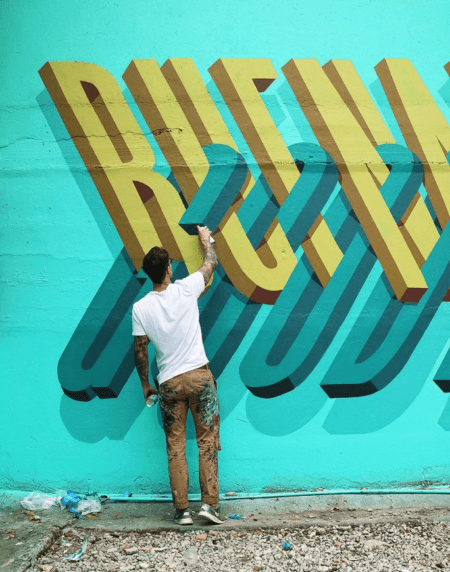
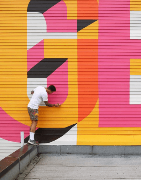
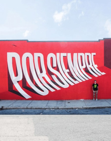
One of the most exciting things about typography is that it can be used in a wide variety of art forms. It is not just limited to graphic design, but it can also be incorporated into art and can be seen in a variety of mediums, from traditional paintings to street art.
Typography in art is often used to create a bold statement. For example, a painter might use large block letters to convey a powerful message in their artwork. Street artists might use typography to add a playful element to their work or to create a unique style that’s instantly recognisable.
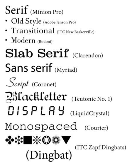
In graphic design, typography is used to create a hierarchy of information. By using different fonts, sizes, and colours, a designer can create a visual order that guides the viewer’s eye through the design. This can be particularly useful when creating posters, advertisements, or websites. One of the most important aspects is legibility. A designer needs to make sure that the text is easy to read, and that the typography doesn’t distract from the message. This can be achieved by choosing appropriate fonts, sizes, and colours, as well as ensuring that there is enoughcontrast between the text and the background. Typography should also convey emotion, tone, and personality. For example, a serif font like Times New Roman can convey a sense of tradition, while a sans-serif font like Helvetica can feel modern and sleek. A script font can be elegant and formal, while a bold, thick font can be loud and attention-grabbing.
Typography has a long history. As one of the first and fundamental forms of communication, writing and typography can be traced back to the Upper Palaeolithic times when cave paintings were seen to also show symbols as a form of language. Genevieve von Petzinger, paleoanthropologist and rock art researcher has been studying and researching these cave symbols to try and understand their meaning. She has compiled a database of 5,000 geometric shapes, lines and squiggles from 146 Ice Age caves!
It took quite some time until Typography with movable type was invented. During the eleventh-century Song dynasty in China (990–1051), Bi Sheng created a movable type system which was manufactured from ceramic materials. This clay-type printing continued to be practised in China until the Qing Dynasty when Wang Zhen was one of the pioneers of wooden movable type.
The first historical typeface design was created by Nicolas Jenson. He created a Roman-style typeface, designed in 1470. Before Jenson’s design, typefaces and book designs were modelled after handwritten manuscripts that predated the invention of the printing press.
Over the years, typography has developed massively, and many artists now use typography in their artworks. American Conceptual artist Barbara Kruger for example, is known for her large-scale photographic works overlaid with bold text in white-on-red Futura Bold Oblique font. Her works often feature provocative statements that challenge traditional gender roles, consumerism, and political power structures.
American artist Ed Ruscha is known for his paintings and prints that incorporate words and phrases in unconventional ways. His works often feature simple, graphic compositions with text in sans-serif fonts that are reminiscent of commercial signage. He is quoted as saying ‘Some artists do roses, but I work primarily with words’.
Honk is a great typographical example of Ruscha’s work created in 1962. It depicts its title word in diagonally inclined, capitalised serif typography.
Street artist Shepard Fairey is known for his politically charged works that combine images and text. His most famous piece which I think most of us will recognise is the “Hope” poster he created for Barack Obama’s 2008 presidential campaign. The poster features a stylized portrait of Obama with the word “Hope” in bold, sans-serif font.
Fairey based the work on an Associated Press photograph by Mannie Garcia, which he transformed with his signature high-contrast stencil technique, inspired by the political message and bold graphics of Soviet Socialist Realism. First disseminated as a street poster, the image was later used to create thousands of stickers and T-shirts and was widely circulated online.
Emblazoned with the word “Hope” and featuring reds and blues that complement the campaign logo designed by Sol Sender, Fairey’s portrait was quickly adopted as an official image of Obama’s 2008 presidential campaign.
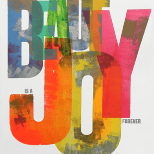
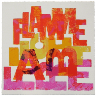
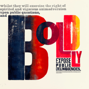
One prominent British typographical artist is Alan Kitching. He is known for his distinctive use of letterpress printing techniques to create bold and expressive typographic designs. Kitching has worked with numerous clients and organisations over the course of his career, and his work has been exhibited in galleries and museums around the world. He is also a noted educator and author, having published several books on typography and design. It seems that typography is in his blood as his grandad was a sign writer for London North-eastern Railway.
Kitching said that printing always used black ink on white paper and if there was the need or possibility to use a colour, you used red. He embarked on trying to get away from this black and white (and red) printing background and move into another area where he could develop printing with a wider colour range. He left black and white behind to use more unusual pinks, browns and greens together on the same prints.
Typography is an incredibly versatile art form that can be used in a wide variety of ways. Whether you’re a graphic designer, a fine artist, or just someone who appreciates beautiful design, typography is an essential part of the creative process. By taking the time to understand the principles of typography and how it can be used to enhance a design, you can create truly memorable works of art.
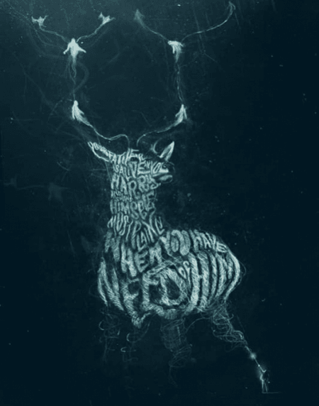
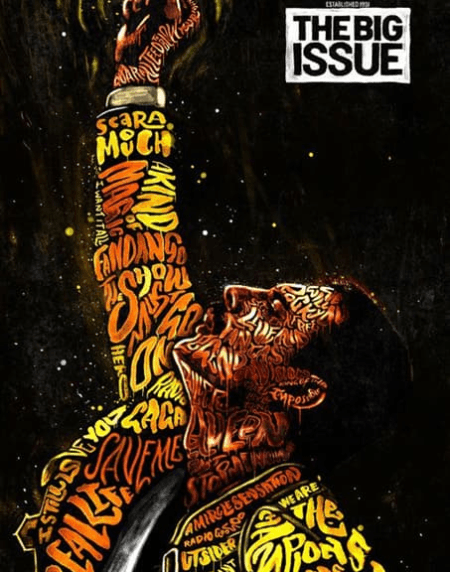
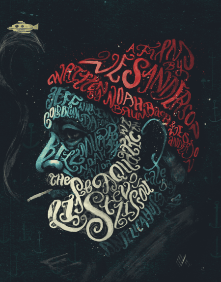
One thing I love about typography is that it’s constantly evolving. New typefaces are created every day, and trends come and go. For example, in recent years we’ve seen a rise in hand-lettered and brush-script fonts, as well as a resurgence of vintage typography styles. Typographical artworks are appearing more and more in advertising and day-to-day products. My favourite current artist/designer is Peter Strain who has created some amazing typographical posters based on Harry Potter as well as typographical portraits of Freddie Mercury and Joaquin Phoenix as The Joker. The letters themselves form the images. They really are beautiful works of art.
There’s no doubt that typography is a powerful communication tool in the hands of artists and designers alike. So, the next time you see a beautiful font, take a moment to appreciate the artistry behind it and the impact it has on the design. Who knows, maybe you’ll be inspired to create your own typographical masterpiece!
Heidi & Gus


